Overview
A histogram is a graphical summary that can be created to help us visualize the shape and distribution of our data set. Histograms deal with numeric data sets, in which values are binned, and plotted like a bar graph with consecutive bars touching.
We can control the number of bins, which is important for us in visualization. Most histograms fare best when there are somewhere between 5 and 20 bins of data, and really depends on how many data points we have in the set, and how spread out they are. Sometimes, the bin breakout comes naturally (Maybe binning exam scores by letter grade), but other times, there is no clear-cut methodology for it. When we run into these situations, we can play around with the number of bins to try and get the best visualization of our data that we can.
Once we create our histogram, we can describe the shape as follows:
Symmetric vs Skew
If a distribution is symmetric or approximately symmetric, the mean and median of the data set will be approximately equal to one another. If we were to draw a line at the median point, it will look roughly the same on both sides of the line.
If a distribution is skew, there will appear to be a “tail” associated with the data set. A data set that is skew left (or negatively skewed) will have the data points tail off on the left side of the histogram. The mean will be smaller than the median in a skew left distribution. A data set that is skew right (or positively skewed) will have the data points tail off on the right side of the histogram. The mean will be larger than the median in a skew right distribution.
Unimodal vs Bimodal
A distribution is considered unimodal if it has one distinct “peak” about it. This is a general peak and does not refer to every individual rise and fall of bars.
A distribution is considered to be bimodal if it has two distinct peaks about it. We often see bimodal distributions when we either combine two populations together, or the population of interest breaks itself up into two naturally occurring subgroups.
If we happen to have a nominal data set, say a collection of everyone's favorite color, our choice of graphical summary will change. We can still create a frequency table of our data, but instead of having numeric classes with widths, we will just use the singular outcome. So, we may have a frequency table that looks like this:
| Color | Frequency |
| Green | 27 |
| Red | 42 |
| Yellow | 21 |
| Blue | 38 |
| Orange | 12 |
| Pink | 14 |
From this sort of data set, we can either create a pie chart, which represents the relative frequencies of each category as a slice of a "pie", or we can create a bar graph, with each category having its own slot and the frequency plotted on the y-axis. This bar graph differs from a histogram as the consecutive bars will not touch, as we are not trying to create a continuum of values.
Instructions
For this discussion post, we are going to create a histogram for the following data set:
7, 4, 15, 17, 23, 27, 21, 28, 31, 35, 39, 32, 37, 33, 39, 49, 47, 43, 44, 44, 44, 45, 47, 51, 54, 53, 59, 57, 53, 62, 69, 69, 67, 64
Use this link to create your histogram: https://www.socscistatistics.com/descriptive/histograms/ Take the data set above, and copy/paste it into the empty box, then click generate.
Discussion Prompts
Answer the following questions in your initial post:
- When you enter the data, the applet will create a histogram using what it thinks is the proper number of classes. Post this histogram and describe the distribution. (Symmetric, skew left, skew right? Is it unimodal or bimodal?)
- After you create this base histogram, you can use the “Edit tool” and play around with the number of classes, and even create your own class range. After playing around with this, which number of classes do you think is the best to show our data set? Why did you choose this value? Post this new histogram to support your reasoning.
Supporting Resources: https://www.youtube.com/watch?v=AndS0RLdxt
Citations
Arcidiacono, G. (2021). Statistics calculator: Box plot. Alcula. http://www.alcula.com/calculators/statistics/box-plot/
Furey, E. (2023). Descriptive statistics calculator. CalculatorSoup. https://www.calculatorsoup.com/calculators/statistics/descriptivestatistics.php
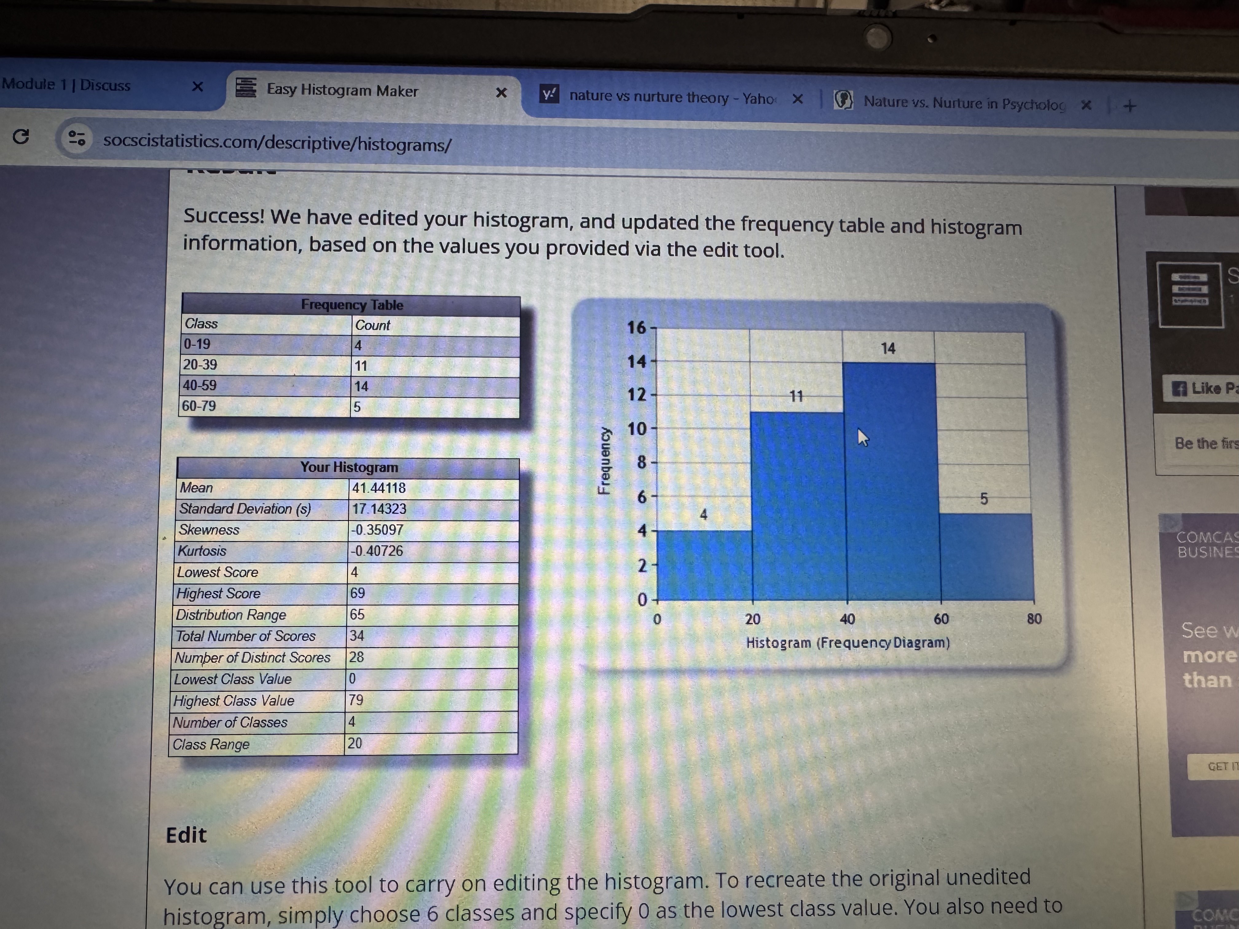
My response is attatched below
Peer1:
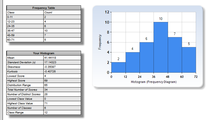
As I plugged the data into the applet, it automatically generated a histogram with six bins from 0–71. The frequency table shows that most of the scores fall into the mid-values, particularly in the class 36–47 with the highest frequency of 10. The shape of the first histogram appears to be unimodal, with a single peak in the center. As per the value of skewness of –0.35097, the distribution is left-skewed but very close to being symmetric overall. The mean of 41.44 is also very close to the center of the distribution, lending support to this interpretation too.
After experimenting with the "Edit" feature to change the number of classes, I found that reducing the number of classes to four made the histogram too broad, masking important variations in the data. On the other hand, increasing the number of classes to eight or more made the histogram scattered and dissimilar, making it impossible to explain any trend meaningfully. Therefore, keeping six classes provided the best descriptive and visually balanced representation of the data. It reveals a clear trend without giving up precision or being overly complex.
In short, the best histogram uses six classes with a class width of approximately twelve points. It best portrays the slightly left-skewed, unimodal shape of the data, in which most scores are concentrated at the middle class of 36–47. It provides a clear, informative graphical representation of the dataset and continues to be easy to read and understand interpretability.
W/C 250
References
Social Science Statistics. (2019). Easy Histogram Maker. Socscistatistics.com. https://www.socscistatistics.com/descriptive/histograms/
Arcidiacono, G. (2021). Statistics calculator: Box plot. Alcula. http://www.alcula.com/calculators/statistics/box-plot/Links to an external site.
Furey, E. (2023). Descriptive statistics calculator. CalculatorSoup. https://www.calculatorsoup.com/calculators/statistics/descriptivestatistics.phpLinks to an external site.
The Organic Chemistry Tutor. (2019). How To Make a Histogram Using a Frequency Distribution Table. In YouTube.https://www.youtube.com/watch?v=AndS0RLdxtk.
Peer2:
When I entered the data set into the histogram, too, it created six classes with values ranging from 0 to around 71. The histogram showed most of the numbers clustered in the middle, especially between about 36 and 47, which had the highest frequency. There were fewer values at the very low and very high ends. The shape looked slightly skewed to the right, with a few higher numbers stretching out the tail on that side. It wasn't perfectly even, but it looked balanced primarily with one clear peak, so it's unimodal.
After playing around with the edit tool, I tried changing the number of classes to see how it affected the graph's appearance. When I added fewer classes, the histogram showed more detail and became easier to read. To me, changing the data to four classes was the best choice —it made the data look smooth and easy to understand while still showing the overall pattern. Overall, the histogram shows a mostly normal distribution with a slight right skew, which makes sense given the numbers' spread. I hope I explain it right and did the histogram the correct way. What an Interesting way to be introduced to statistics. Whew!